
Understanding the District Map
The District Map shows your district, the precincts within, and where voters are concentrated by party lean and demographics. This information is pulled from voter files and shapefiles for your district and overlapping precincts. As you apply filters in the Filter Panel, the map updates to reflect your target population.
When you first open RunningMate, the District Map shows your district. Inside you can see precincts that overlap with your district and their party lean. In states that track partisan voter registration, party lean is based on voter registration. In states that don’t track partisan voter registration, party lean is based on modeled partisanship scores. Precincts that are darker red contain people modeled to be known or likely Republicans, and precincts that are darker blue contain more known or likely Democrats.
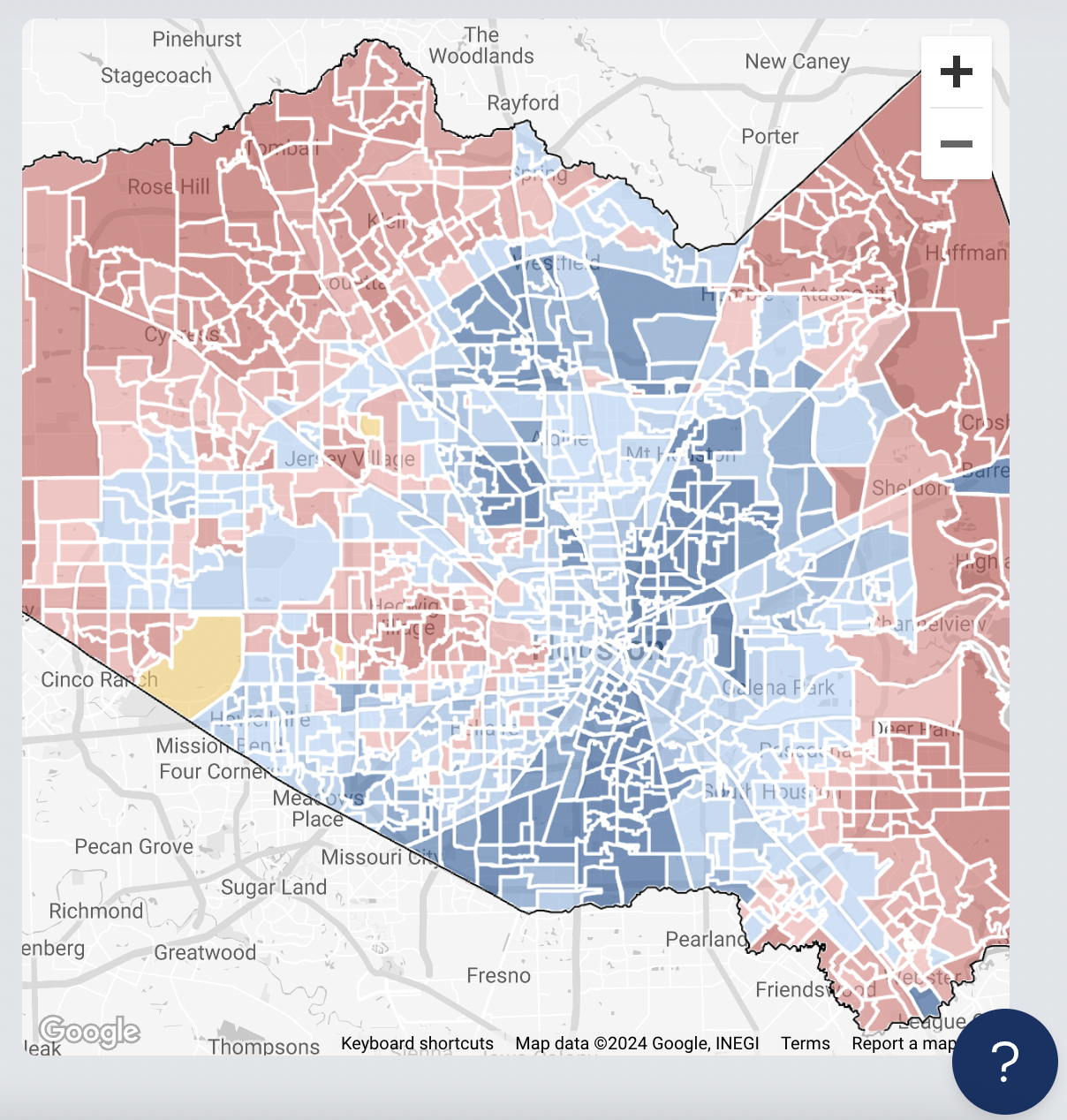
Once you apply one or more filters, precinct shading shifts to show you the density of targets matching your filters in each precinct.
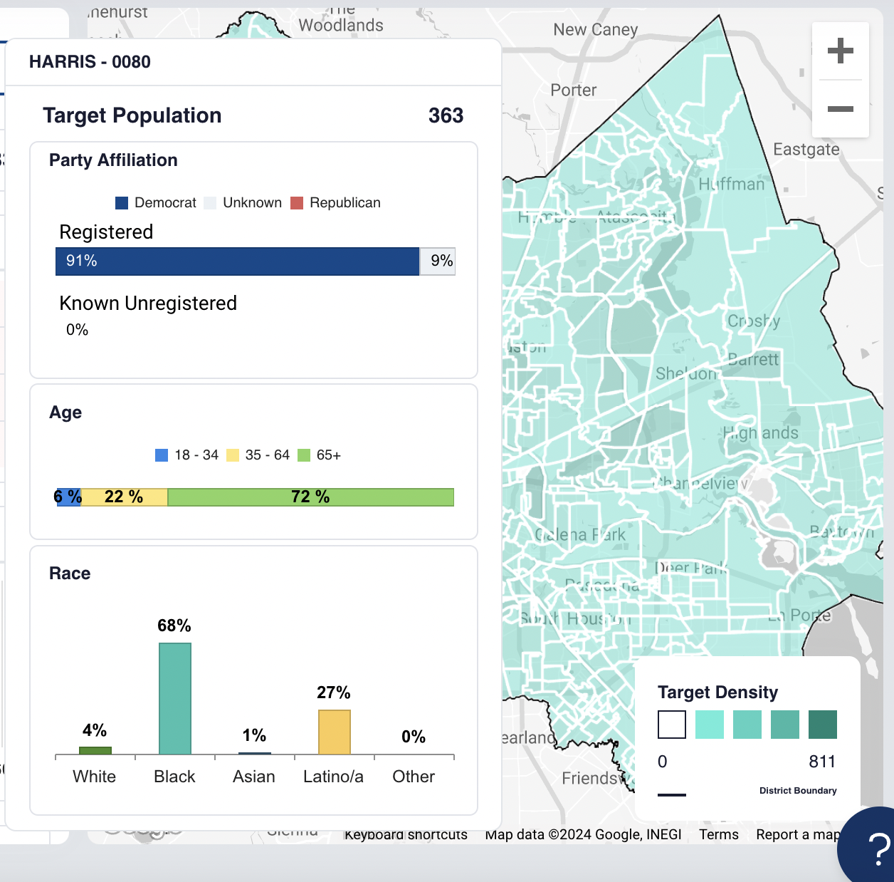
Target Density
The Target Density legend in the lower right shows you how to interpret the density color scale.
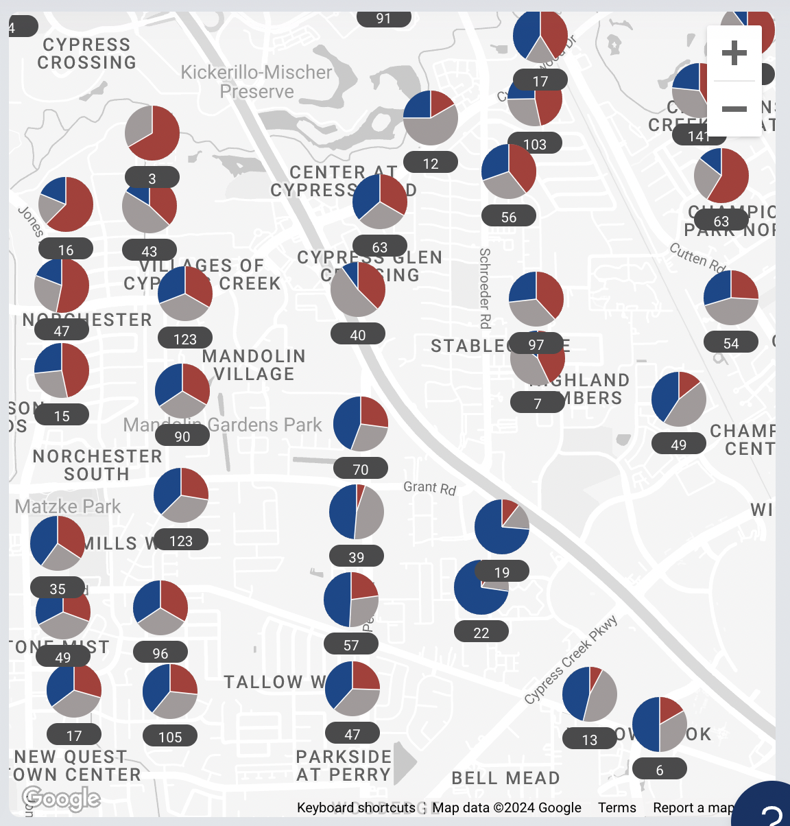
Pie Chart Clusters
When users are looking at the district map and zoom in, they will first see precinct-level data represented by pie charts. These show the party lean of voters in each precinct. The red portions represent likely or known Republicans, while the blue portions represent likely or known Democrats.
Users can hover their cursor over a precinct to view the summary of the population that lives there. Get a closer look by zooming in. You can zoom in by clicking the “+” zoom button, double clicking on the map, or “pinch-zooming” with two fingers.
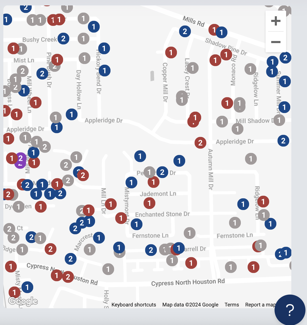
Individual Markers
If you zoom in further, those pie charts transition into individual markers. As you zoom, your view will transition from the precinct view to a view of individual targets represented by markers.
Blue markers contain likely Democrats, red markers contain likely Republicans, and purple markers contain a mix. Targets who live close to each other are grouped into a pin with a number that represents the number of people at that location.
Individual Markers: Target Info
View the Target Info panel by clicking on a map marker. Here, users can view the registration and vote history, as well as the demographic data about each person at that residence.
